September 19, 2022

The first time I visited Philadelphia’s museum of art, it was a breathtaking experience. It had classic Dutch paintings like Peasants Drinking at a Window by Adriaen van Ostade.
The art took over my senses and transported me to another world. It was truly like stepping back in time.
I am a big fan of Dutch-style paintings from the 15th century. One day, my friend and food stylist, Susan, and I were looking at some of these paintings online and thinking about how fun it would be to recreate them with food. We decided to give it a try!
I’ve always been fascinated by the work of the Dutch Masters. Their use of light and color has always awed and inspired me.
Their use of light and color has always awed and inspired me. I love their work and wanted to create a series of images that looked similar to classic Dutch paintings.
Dutch art from the 15th century is stunning. I admire the deep tones and soft lighting. The drama of the poses and gestures, and how it feels like I’m stepping back in time when I look at these paintings.
My favorite painting is by Vermeer called The Milkmaid (1660). It’s a simple scene: a woman in front of an open window with a room behind her where you can see her pouring milk into a pitcher. The deep tones give it drama; the warm lighting makes it feel like stepping back in time; and even though there are only two people in the picture, they both seem so full of life.

These beautiful pieces were shot with a lot of techniques and care.
I’ve always liked the Dutch Masters for their ability to capture emotion in such a simple way. I wanted to try and capture the same movement and emotion that they do, but with a modern twist.
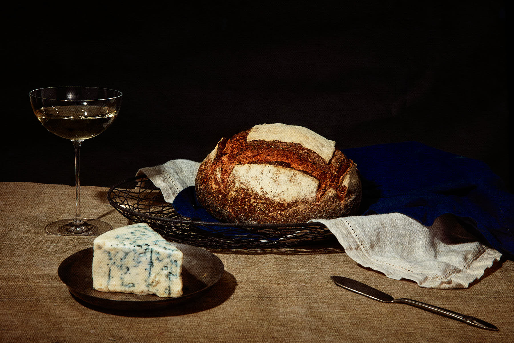
I wanted to create a photo that captured the feeling of being in a classic Dutch Masterpiece painting, and I wanted to do it with food.
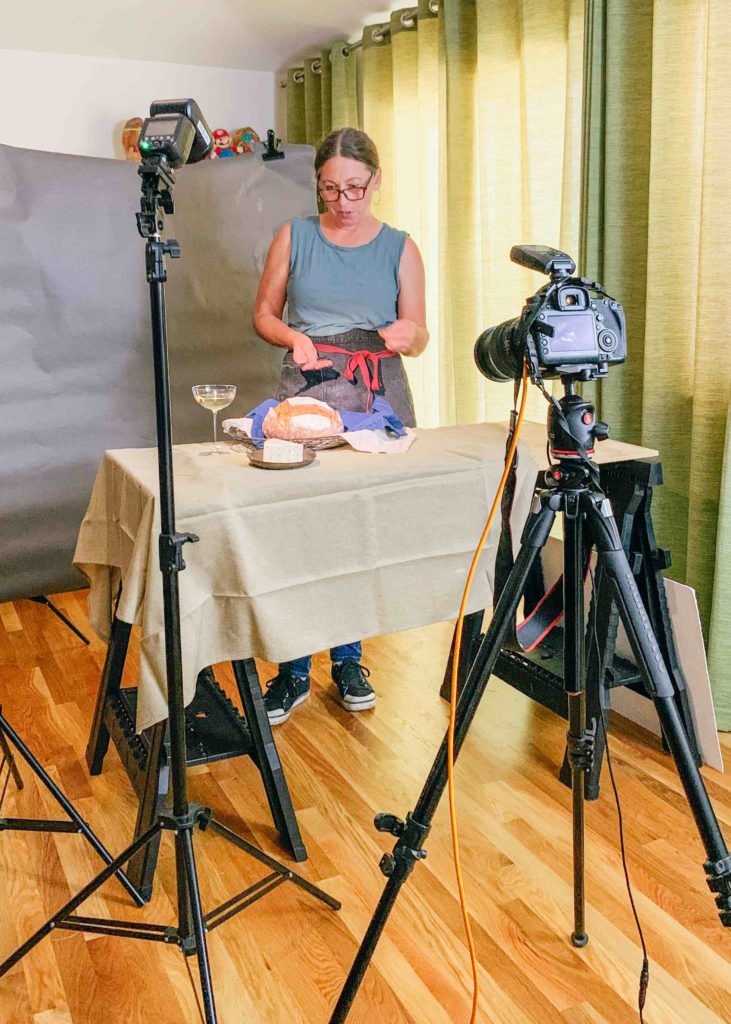
For this shot, we used a combination of soft and hard light. We used a large softbox for the soft light and used direct flash for harsh light.
We had to learn more about classic Dutch paintings and look for details that we could use in our pictures.
The secret to the shooting of these beautiful pieces was research. It took a lot of research on paintings and look for details within them that we could incorporate into the images.
We used Johanne Vermeer’s painting, “Girl With the Pearl Earring,” by one of our favorite artists ever. We loved how he captured the essence of this woman. This was something that we wanted to incorporate into our version as well!
The end result was fantastic and super fun to create. Who knew that oysters could look so good?
The end result was fantastic and super fun to create. Who knew that oysters could look so good? We were so inspired by the process that we’ve decided to make a few more food paintings as soon as possible.
It was a lot of fun to do this shoot. I hope you enjoyed learning about our process and seeing the images!
If you’re ready to take your business to the next level and get super weird, give us a call. We can’t wait to help you grow!
Related
© 2021 Austin Food Guide | Brand + Website by Carrylove Designs | Reserve Your Spot
