June 19, 2023
Introduction
Today we’re diving into the world of color in food photography. You know that feeling when you see a drool-worthy dish that just begs to be eaten? That’s the power of color at work! Let’s delve into the psychology of color, discover ways to select the perfect color palette, and learn how to effectively use complementary and contrasting colors in your food photography.
The Psychology of Color in Food Photography
Color plays a significant role in how we perceive and experience food. Bright colors make food look more appetizing, while dull colors make it less appealing. For example, think about a bright red strawberry versus a brown, overripe one. Which one would you rather eat?
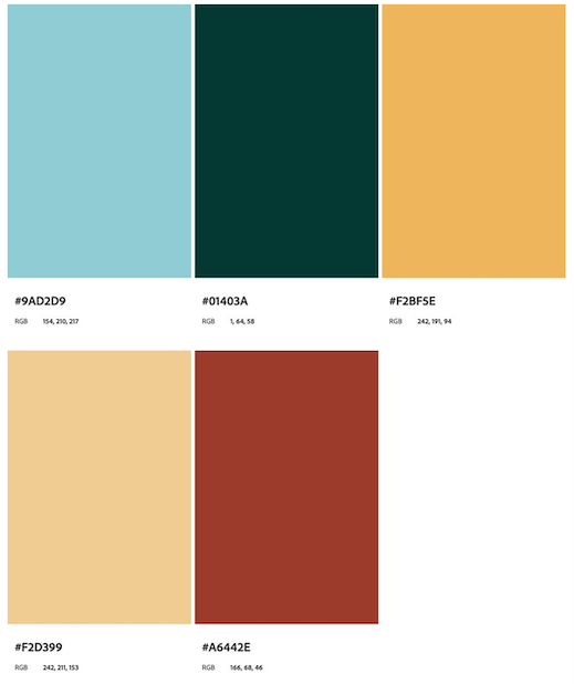
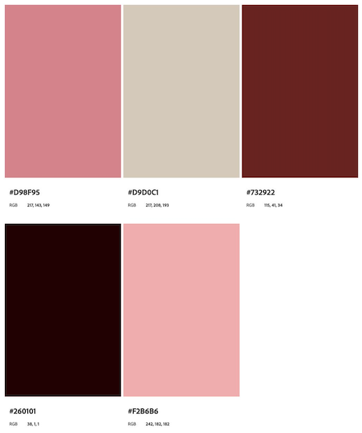
When selecting colors for your food photography, consider the emotions and feelings you want to evoke in your audience. Warm colors like red, orange, and yellow can stimulate appetite and create a sense of warmth and comfort. Cool colors like blue, green, and purple can convey freshness and cleanliness.

Tips for Choosing the Right Color Palette for Your Images
1. Know your subject: Consider the natural colors of the food you’re photographing and use them as a starting point for your color palette.
2. Keep it simple: Stick to a limited color palette to create a cohesive and visually appealing image. Too many colors can be overwhelming and distracting.
3. Consider the mood: Think about the atmosphere you want to create with your image. Do you want it to be bright and energetic or moody and romantic? Choose colors that align with the desired mood.
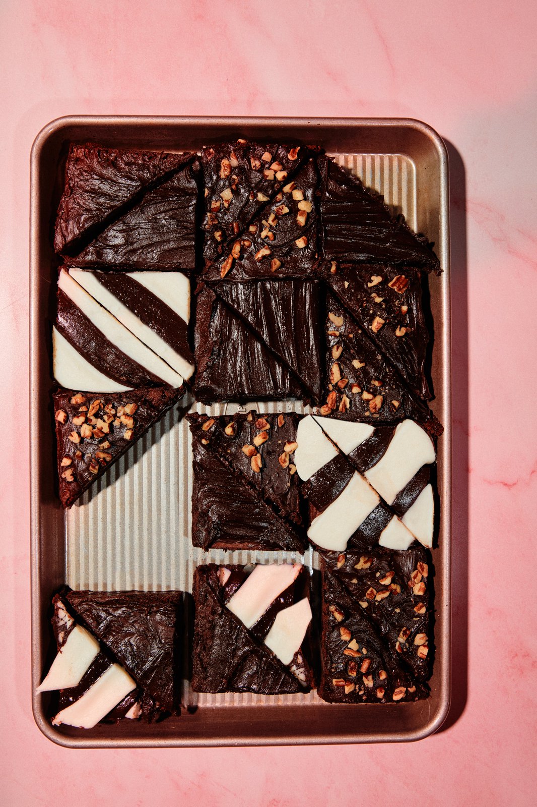
4. Experiment with backgrounds: Don’t be afraid to play around with different backgrounds and surfaces to see how they affect the overall color palette and mood of your image.
How to Use Complementary and Contrasting Colors Effectively
Colors that are opposite each other on the color wheel are called complementary colors. For example, red and green or blue and orange are complementary colors. Using complementary colors in your food photography can create a striking and eye-catching effect.
On the other hand, contrasting colors are those that are different but still work well together, like purple and yellow or pink and teal. Contrasting colors can add visual interest and depth to your images. To use complementary and contrasting colors effectively:
1. Balance is key: Ensure that one color doesn’t overpower the other. Use them in equal proportions, or use one as the main color and the other as an accent.
2. Be mindful of saturation: Highly saturated colors can be overwhelming and distracting. Consider using more muted or pastel tones to create a more harmonious and visually appealing image.
3. Experiment with combinations: Don’t be afraid to mix and match colors to find the perfect combination for your image. Remember, practice makes perfect!
In conclusion, color is a powerful tool in food photography that can significantly impact the way your audience perceives and experiences your dishes. By understanding the psychology of color, choosing the right palette, and effectively using complementary and contrasting colors, you can create visually stunning and appetizing images that will leave your audience craving more. So go ahead, experiment with color, and watch your food photography skills soar to new heights. Remember, the perfect palette is just a click away!
Ready to harness the power of color in your food photography and create visually stunning images that showcase your brand? Contact us to learn more about our services and how we can help you elevate your food photography game. Let’s create some deliciously vibrant content together!
Related
© 2021 Austin Food Guide | Brand + Website by Carrylove Designs | Reserve Your Spot
